Eight businesses,
before and after us.
The businesses are made up, the websites are real: for each one, we put the old site and the new one online, then checked both. Pick a trade, then drag across the image. The demo sites are in French.


Trattoria Exemple’s new site was built by Everywhere, our sister house. See a site like this for your trade (in French).
Up close
Six flaws, and what we changed.
1. The photo
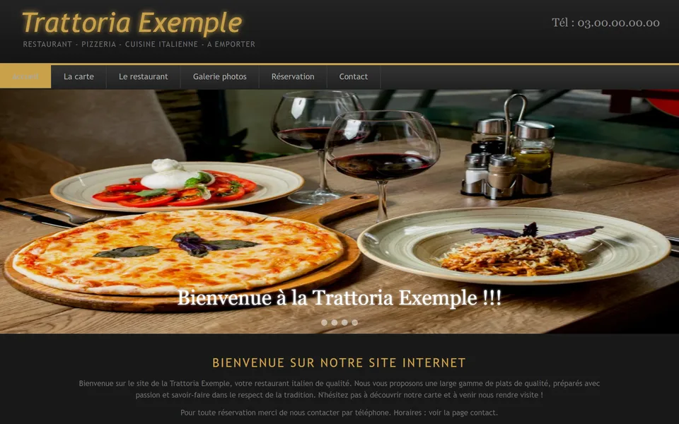

- Before
- Stretched to fill the banner, with no description: a blind visitor has no idea what it shows.
- After
- Cropped without distortion, and described in a few words: “Une pizza margherita, une assiette de pâtes et deux verres de vin rouge sur une table en bois”.
2. The headline
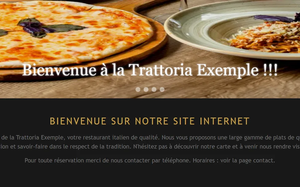

- Before
- Two “Welcome” lines in a row, and nothing tells Google what the page is really called.
- After
- A real headline that says what the business does: “Pizzas au feu de bois.”
3. The text


- Before
- Tiny, light grey on white: 8 passages too pale to read without effort.
- After
- Larger, darker letters, checked across the whole page.
4. The phone number


- Before
- Written small at the top of the page; on a phone, tapping it does not call.
- After
- A “Call” button at the top, and today’s hours right above the “Réserver une table” button.
5. Cookies


- Before
- A banner stuck to the bottom of the screen, with a single “OK” button: no way to say no.
- After
- The site sets no cookies, so no more banner.
6. On a phone


- Before
- The computer page shrunk onto the screen: you have to zoom in to read.
- After
- A page made for the phone, readable without zooming.
| What is scored | Before | After |
|---|---|---|
| Overall score | 75 | 92 |
| Readable by all | 58 | 99 |
| Security | 82 | 96 |
| Reaching you | 86 | 100 |
| Serious problems for people with poor eyesight | 3, 1 very serious | 0 |
| Readability score from Google’s tool | 43 | 100 |


Plomberie Exemple’s new site was built by Everywhere, our sister house. See a site like this for your trade (in French).
Up close
Six flaws, and what we changed.
1. The photo


- Before
- Stretched to fill the banner, with no description: a blind visitor has no idea what it shows.
- After
- Cropped without distortion, and described in a few words: “Un plombier ouvre un robinet de cuisine, sa caisse à outils ouverte sur le plan de travail”.
2. The headline


- Before
- Two “Welcome” lines in a row, and nothing tells Google what the page is really called.
- After
- A real headline that says what the business does: “Une fuite ? Appelez, on décroche.”
3. The text

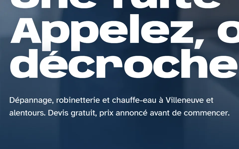
- Before
- Tiny, light grey on white: 11 passages too pale to read without effort.
- After
- Larger, darker letters, checked across the whole page.
4. The phone number


- Before
- Written small at the top of the page; on a phone, tapping it does not call.
- After
- A “Call” button at the top, and today’s hours right above the “Appeler le plombier” button.
5. Cookies


- Before
- A banner stuck to the bottom of the screen, with a single “OK” button: no way to say no.
- After
- The site sets no cookies, so no more banner.
6. On a phone


- Before
- The computer page shrunk onto the screen: you have to zoom in to read.
- After
- A page made for the phone, readable without zooming.
| What is scored | Before | After |
|---|---|---|
| Overall score | 75 | 91 |
| Readable by all | 58 | 99 |
| Security | 82 | 96 |
| Reaching you | 86 | 98 |
| Serious problems for people with poor eyesight | 3, 1 very serious | 0 |
| Readability score from Google’s tool | 43 | 100 |


Élec Exemple’s new site was built by Everywhere, our sister house. See a site like this for your trade (in French).
Up close
Six flaws, and what we changed.
1. The photo


- Before
- Stretched to fill the banner, with no description: a blind visitor has no idea what it shows.
- After
- Cropped without distortion, and described in a few words: “Un électricien casqué intervient sur un tableau électrique”.
2. The headline


- Before
- Two “Welcome” lines in a row, and nothing tells Google what the page is really called.
- After
- A real headline that says what the business does: “Plus de courant ? On vient voir.”
3. The text


- Before
- Tiny, light grey on white: 11 passages too pale to read without effort.
- After
- Larger, darker letters, checked across the whole page.
4. The phone number


- Before
- Written small at the top of the page; on a phone, tapping it does not call.
- After
- A “Call” button at the top, and today’s hours right above the “Appeler l'électricien” button.
5. Cookies


- Before
- A banner stuck to the bottom of the screen, with a single “OK” button: no way to say no.
- After
- The site sets no cookies, so no more banner.
6. On a phone
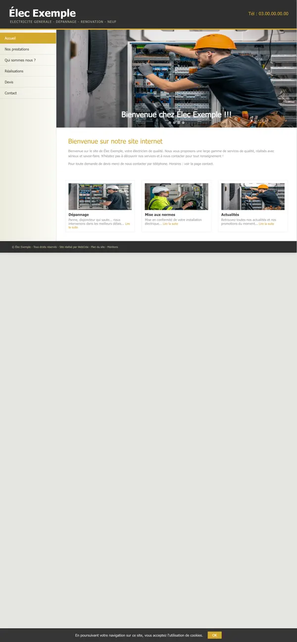

- Before
- The computer page shrunk onto the screen: you have to zoom in to read.
- After
- A page made for the phone, readable without zooming.
| What is scored | Before | After |
|---|---|---|
| Overall score | 75 | 91 |
| Readable by all | 58 | 99 |
| Security | 82 | 96 |
| Reaching you | 86 | 98 |
| Serious problems for people with poor eyesight | 3, 1 very serious | 0 |
| Readability score from Google’s tool | 43 | 100 |


Garage Exemple’s new site was built by Everywhere, our sister house. See a site like this for your trade (in French).
Up close
Six flaws, and what we changed.
1. The photo

- Before
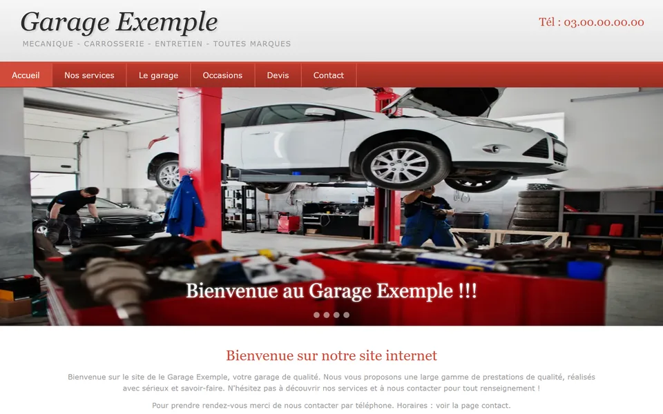
- Stretched to fill the banner, with no description: a blind visitor has no idea what it shows.
- After
- Cropped without distortion, and described in a few words: “Une voiture blanche sur un pont élévateur dans l'atelier du garage”.
2. The headline

- Before
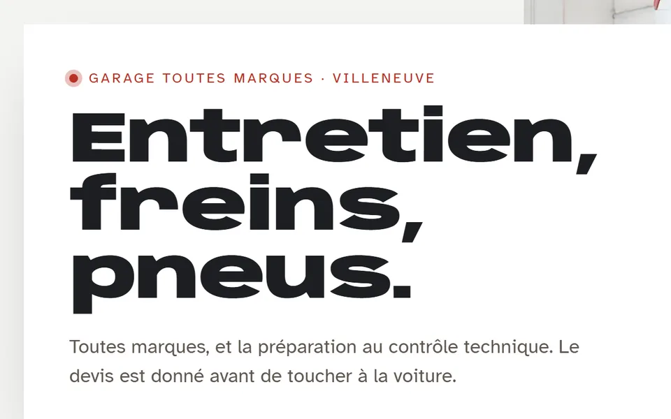
- Two “Welcome” lines in a row, and nothing tells Google what the page is really called.
- After
- A real headline that says what the business does: “Entretien, freins, pneus.”
3. The text


- Before
- Tiny, light grey on white: 11 passages too pale to read without effort.
- After
- Larger, darker letters, checked across the whole page.
4. The phone number
- Before
- Written small at the top of the page; on a phone, tapping it does not call.
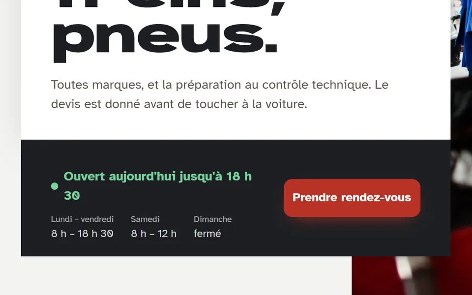
- After
- A “Call” button at the top, and today’s hours right above the “Prendre rendez-vous” button.
5. Cookies


- Before
- A banner stuck to the bottom of the screen, with a single “OK” button: no way to say no.
- After
- The site sets no cookies, so no more banner.
6. On a phone


- Before
- The computer page shrunk onto the screen: you have to zoom in to read.
- After
- A page made for the phone, readable without zooming.
| What is scored | Before | After |
|---|---|---|
| Overall score | 75 | 92 |
| Readable by all | 58 | 99 |
| Security | 82 | 96 |
| Reaching you | 86 | 100 |
| Serious problems for people with poor eyesight | 3, 1 very serious | 0 |
| Readability score from Google’s tool | 43 | 100 |


Salon Exemple’s new site was built by Everywhere, our sister house. See a site like this for your trade (in French).
Up close
Six flaws, and what we changed.
1. The photo


- Before
- Stretched to fill the banner, with no description: a blind visitor has no idea what it shows.
- After
- Cropped without distortion, and described in a few words: “Une coiffeuse coupe une mèche de cheveux blonds aux ciseaux”.
2. The headline


- Before
- Two “Welcome” lines in a row, and nothing tells Google what the page is really called.
- After
- A real headline that says what the business does: “Coupe, couleur, brushing.”
3. The text

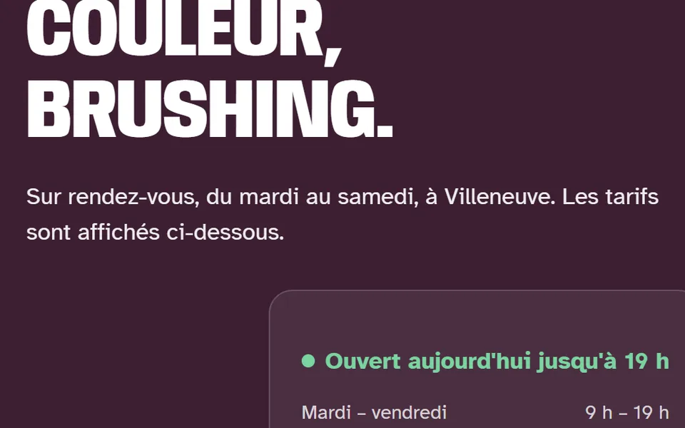
- Before
- Tiny, light grey on white: 8 passages too pale to read without effort.
- After
- Larger, darker letters, checked across the whole page.
4. The phone number

- Before
- Written small at the top of the page; on a phone, tapping it does not call.
- After
- A “Call” button at the top, and today’s hours right above the “Prendre rendez-vous” button.
5. Cookies

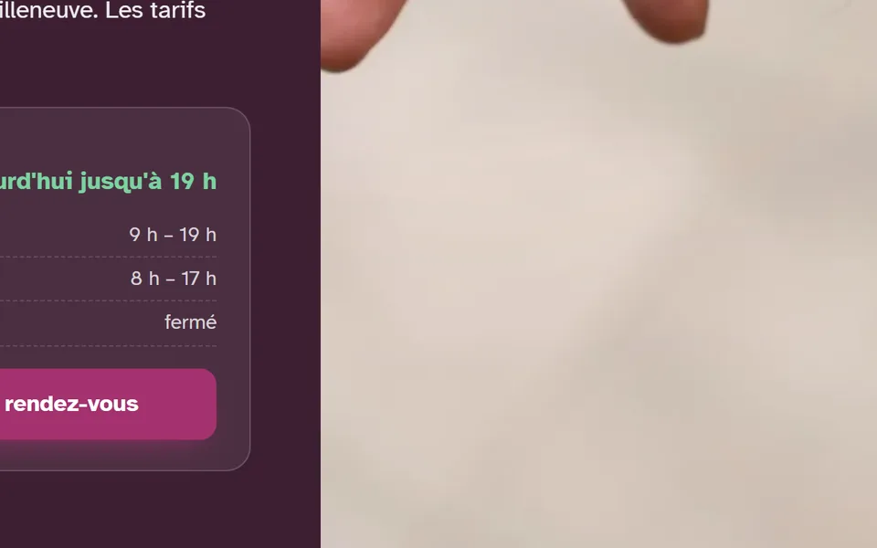
- Before
- A banner stuck to the bottom of the screen, with a single “OK” button: no way to say no.
- After
- The site sets no cookies, so no more banner.
6. On a phone


- Before
- The computer page shrunk onto the screen: you have to zoom in to read.
- After
- A page made for the phone, readable without zooming.
| What is scored | Before | After |
|---|---|---|
| Overall score | 75 | 92 |
| Readable by all | 58 | 99 |
| Security | 82 | 96 |
| Reaching you | 86 | 100 |
| Serious problems for people with poor eyesight | 3, 1 very serious | 0 |
| Readability score from Google’s tool | 43 | 100 |


Institut Exemple’s new site was built by Everywhere, our sister house. See a site like this for your trade (in French).
Up close
Six flaws, and what we changed.
1. The photo

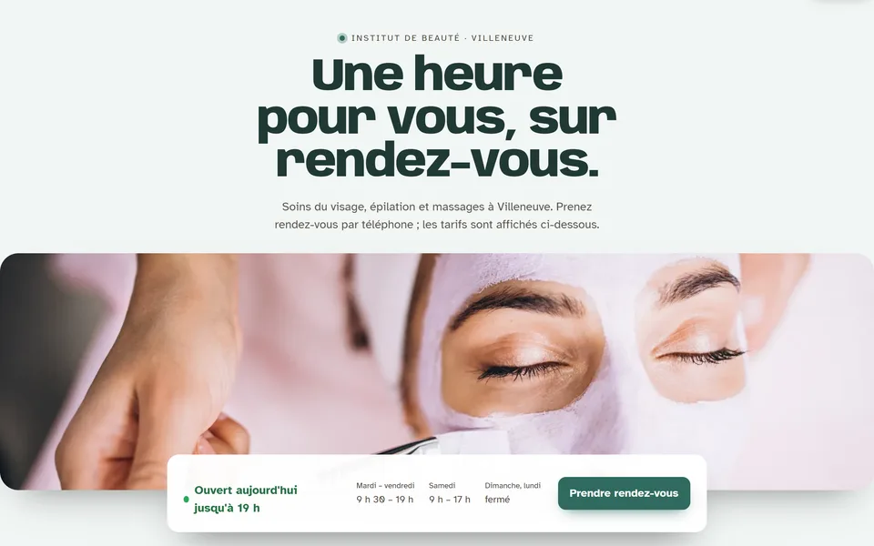
- Before
- Stretched to fill the banner, with no description: a blind visitor has no idea what it shows.
- After
- Cropped without distortion, and described in a few words: “Une esthéticienne applique un masque au pinceau sur le visage d'une cliente”.
2. The headline


- Before
- Two “Welcome” lines in a row, and nothing tells Google what the page is really called.
- After
- A real headline that says what the business does: “Une heure pour vous, sur rendez-vous.”
3. The text
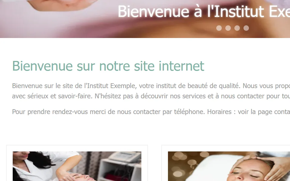

- Before
- Tiny, light grey on white: 14 passages too pale to read without effort.
- After
- Larger, darker letters, checked across the whole page.
4. The phone number
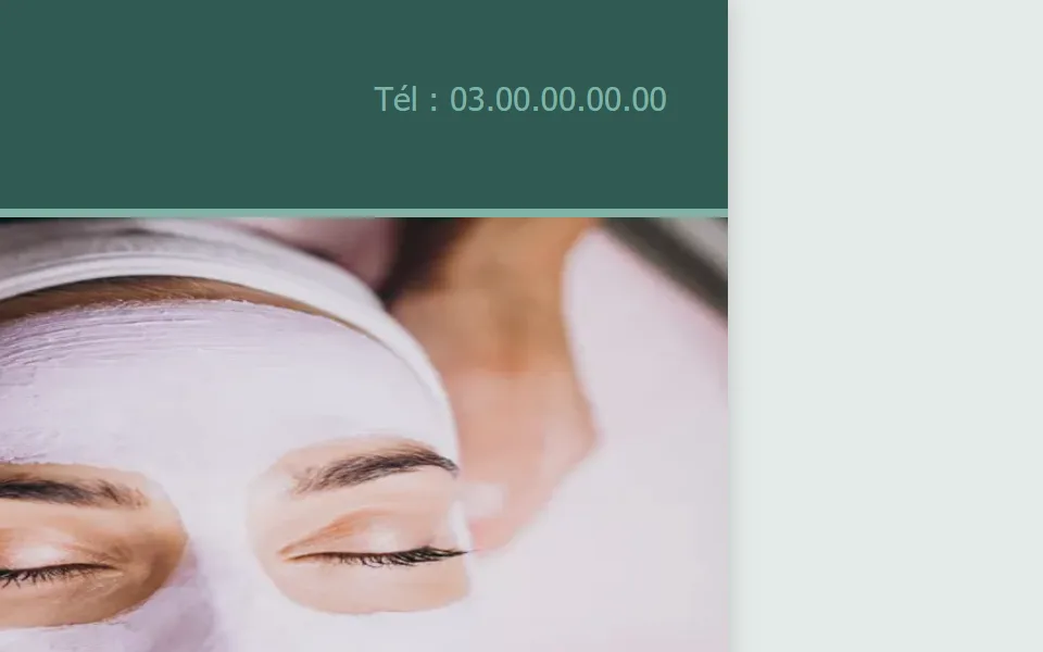

- Before
- Written small at the top of the page; on a phone, tapping it does not call.
- After
- A “Call” button at the top, and today’s hours right above the “Prendre rendez-vous” button.
5. Cookies
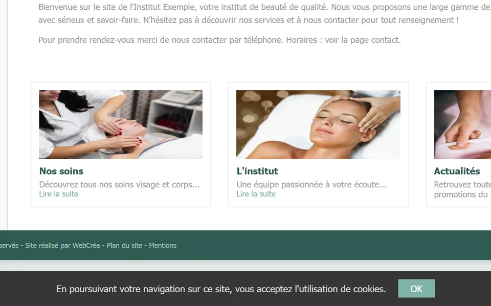

- Before
- A banner stuck to the bottom of the screen, with a single “OK” button: no way to say no.
- After
- The site sets no cookies, so no more banner.
6. On a phone
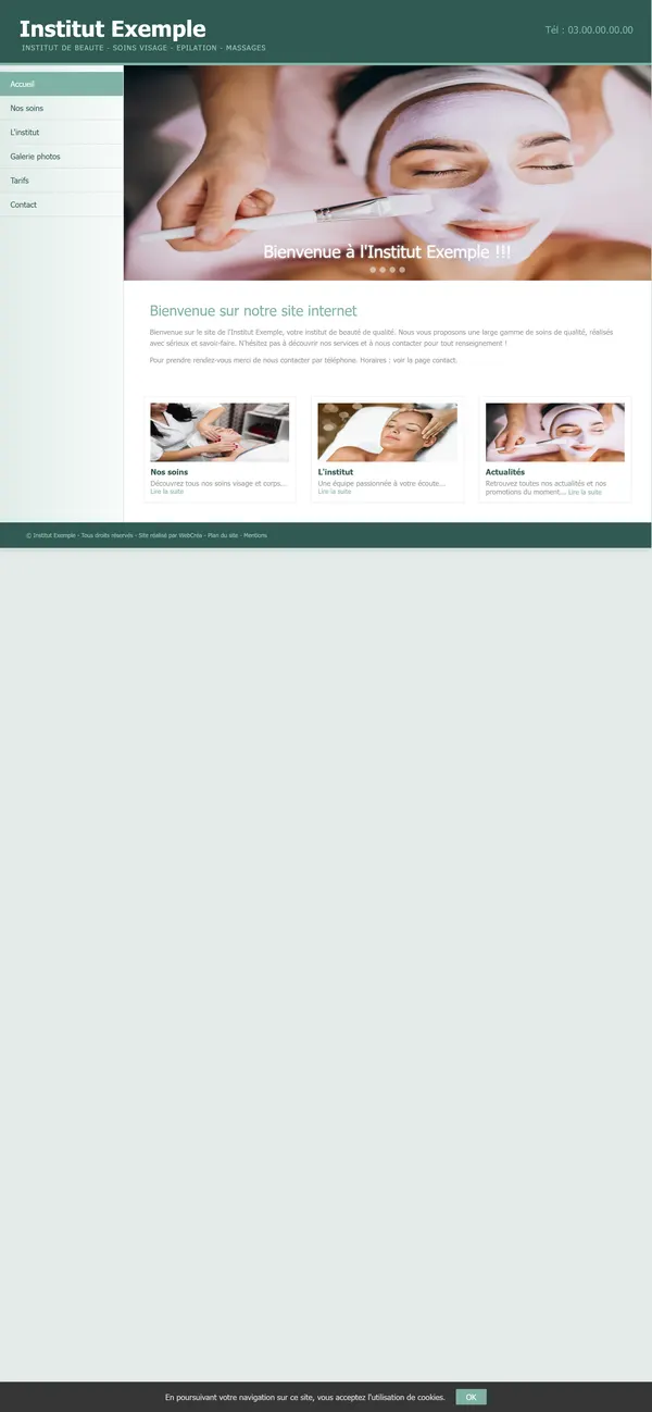

- Before
- The computer page shrunk onto the screen: you have to zoom in to read.
- After
- A page made for the phone, readable without zooming.
| What is scored | Before | After |
|---|---|---|
| Overall score | 75 | 92 |
| Readable by all | 57 | 99 |
| Security | 82 | 96 |
| Reaching you | 86 | 100 |
| Serious problems for people with poor eyesight | 3, 1 very serious | 0 |
| Readability score from Google’s tool | 43 | 100 |


Toiture Exemple’s new site was built by Everywhere, our sister house. See a site like this for your trade (in French).
Up close
Six flaws, and what we changed.
1. The photo

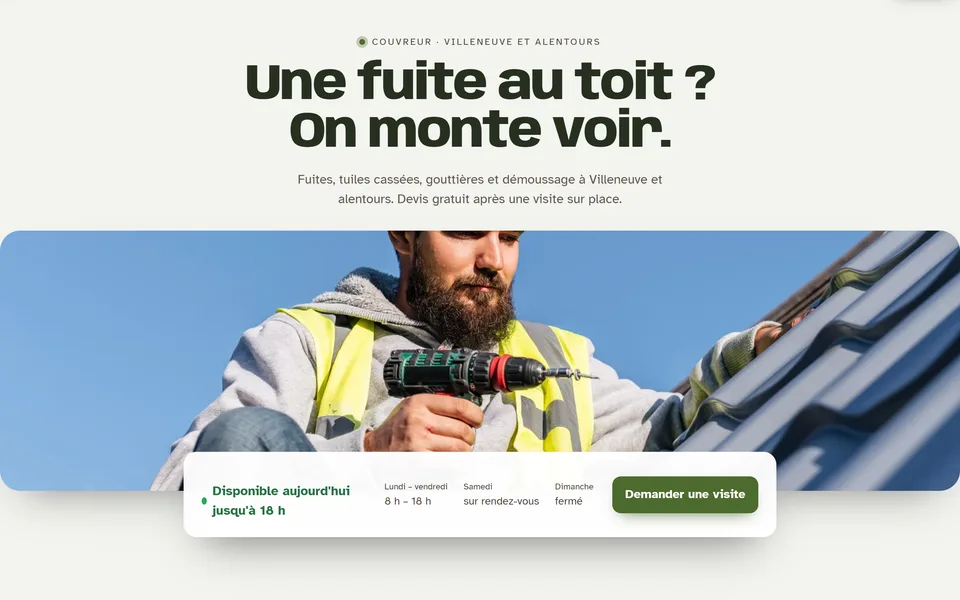
- Before
- Stretched to fill the banner, with no description: a blind visitor has no idea what it shows.
- After
- Cropped without distortion, and described in a few words: “Un couvreur casqué travaille sur un toit, sous un ciel bleu”.
2. The headline
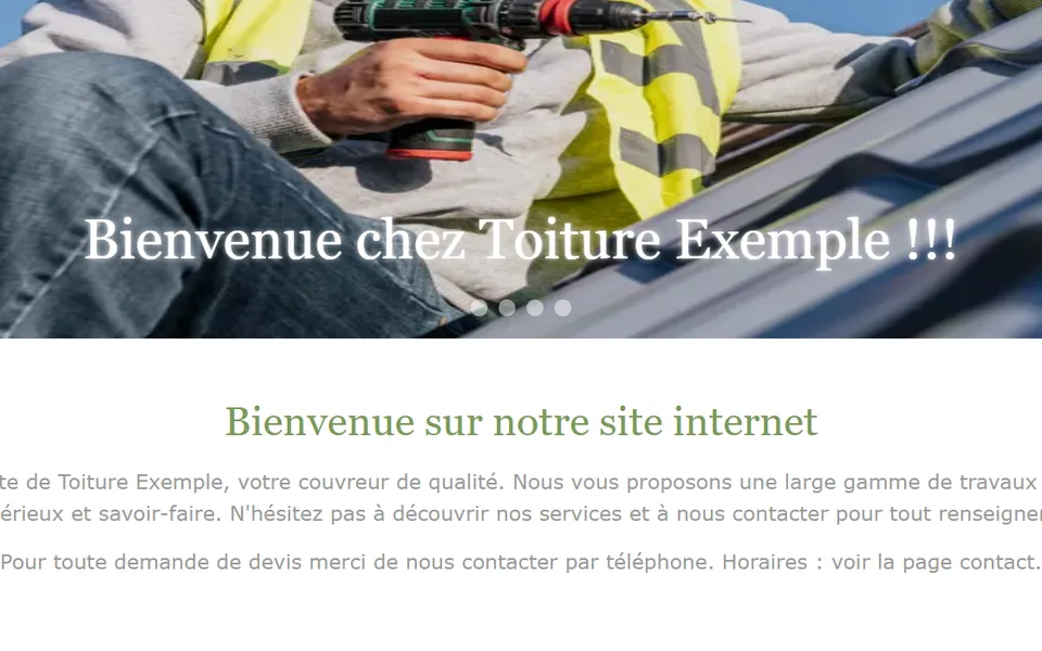

- Before
- Two “Welcome” lines in a row, and nothing tells Google what the page is really called.
- After
- A real headline that says what the business does: “Une fuite au toit ? On monte voir.”
3. The text


- Before
- Tiny, light grey on white: 12 passages too pale to read without effort.
- After
- Larger, darker letters, checked across the whole page.
4. The phone number

- Before
- Written small at the top of the page; on a phone, tapping it does not call.
- After
- A “Call” button at the top, and today’s hours right above the “Demander une visite” button.
5. Cookies
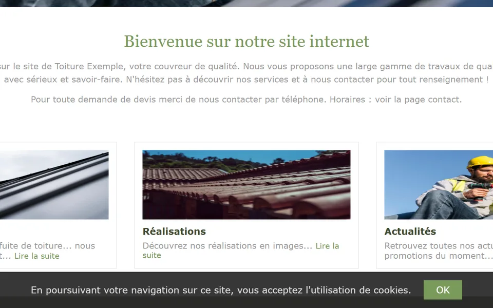
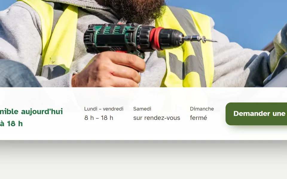
- Before
- A banner stuck to the bottom of the screen, with a single “OK” button: no way to say no.
- After
- The site sets no cookies, so no more banner.
6. On a phone
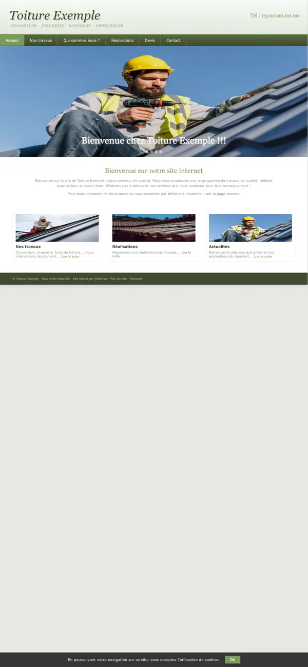

- Before
- The computer page shrunk onto the screen: you have to zoom in to read.
- After
- A page made for the phone, readable without zooming.
| What is scored | Before | After |
|---|---|---|
| Overall score | 75 | 92 |
| Readable by all | 58 | 99 |
| Security | 82 | 96 |
| Reaching you | 86 | 100 |
| Serious problems for people with poor eyesight | 3, 1 very serious | 0 |
| Readability score from Google’s tool | 43 | 100 |


Maison Exemple’s new site was built by Everywhere, our sister house. See a site like this for your trade (in French).
Up close
Six flaws, and what we changed.
1. The photo
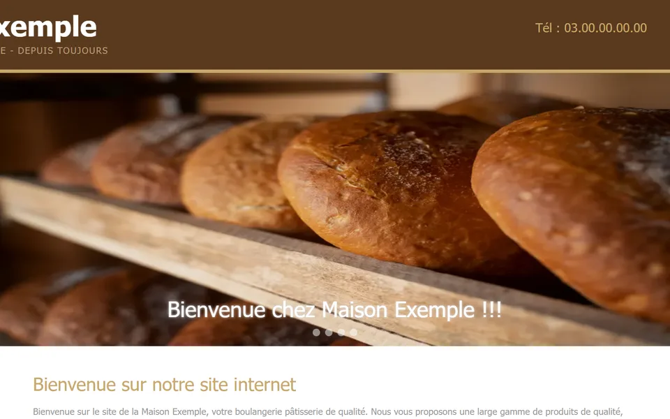
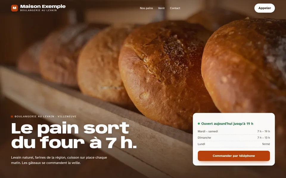
- Before
- Stretched to fill the banner, with no description: a blind visitor has no idea what it shows.
- After
- Cropped without distortion, and described in a few words: “Miches au levain rangées sur une étagère en bois, à la sortie du four”.
2. The headline
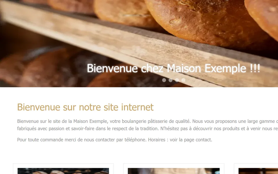

- Before
- Two “Welcome” lines in a row, and nothing tells Google what the page is really called.
- After
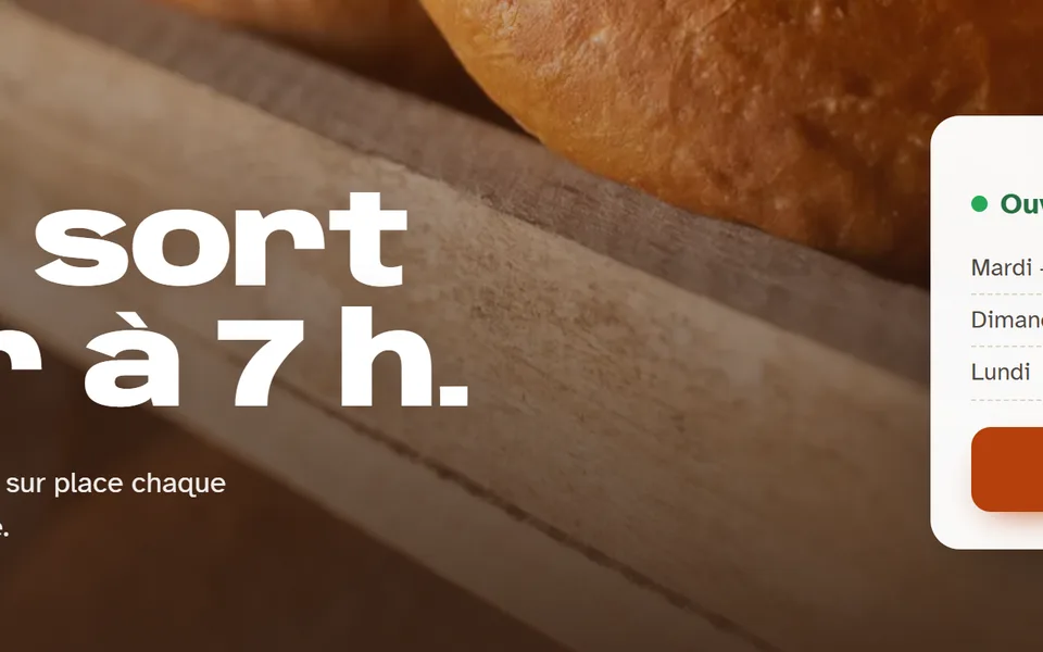
- A real headline that says what the business does: “Le pain sort du four à 7 h.”
3. The text
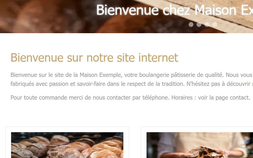

- Before
- Tiny, light grey on white: 13 passages too pale to read without effort.
- After
- Larger, darker letters, checked across the whole page.
4. The phone number


- Before
- Written small at the top of the page; on a phone, tapping it does not call.
- After
- A “Call” button at the top, and today’s hours right above the “Commander par téléphone” button.
5. Cookies
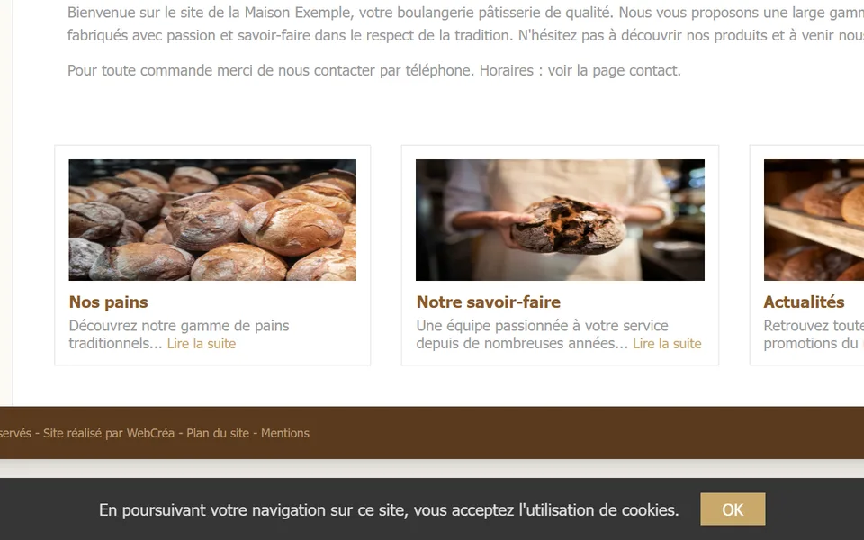
- Before
- A banner stuck to the bottom of the screen, with a single “OK” button: no way to say no.
- After
- The site sets no cookies, so no more banner.
6. On a phone


- Before
- The computer page shrunk onto the screen: you have to zoom in to read.
- After
- A page made for the phone, readable without zooming.
| What is scored | Before | After |
|---|---|---|
| Overall score | 75 | 92 |
| Readable by all | 57 | 99 |
| Security | 82 | 96 |
| Reaching you | 86 | 100 |
| Serious problems for people with poor eyesight | 3, 1 very serious | 0 |
| Readability score from Google’s tool | 43 | 100 |
The demo sites are deliberately hidden from Google, which lowers their “On Google” score. The photo set is made by artificial intelligence; the screens show real captures of the sites. Website photos: Freepik.